Prenuvo

- Client Name
- Prenuvo
- Website
- www.prenuvo.com
- Year
- 2021
- Categories
- Healthcare, Startup
Prenuvo
Chances are you’ve already been impacted by cancer in some way or another. If not, you’re amongst the privileged few who haven’t yet faced cancer or lost someone to the terribly efficient and prolific disease.
There is a silver lining, however. Research shows most cancers are survivable if detected and treated early on. The catch? The best defence is frequent cancer screening via MRI scans, and MRI scans are expensive. Really expensive.
Enter stage left, Prenuvo; a San Francisco-based startup founded by a radiologist on a mission to democratize cancer prescreening by bringing the cost of MRI scans down from $2,500 to $500 per scan; the cost of your annual car maintenance.
With an established product offering, an urgency of purpose, and an ambitious growth plan, Prenuvo came to Massive to help strengthen its brand messaging and craft a website that supported the team’s ambition. Prenuvo’s dream was big – it just needed the presence to match it.
Services
- Brand Messaging
- Brand Visual ID
- User Experience
- Website Design
- Headless CMS Development


One message for three audiences
True democratization requires more than just reducing costs; it means improving physical access. To accomplish its mission, Prenuvo needed to target three key audiences—patients, doctors, and employers with extended health plan providers, each with different content and information requirements.
For patients, Prenuvo needed to address concern, fear, and uncertainty without playing into their users’ understandable anxieties. No “sad-vertising”, as Prenuvo put it. This audience needed the information to be easy to understand and not riddled with medical jargon and acronyms.
Reversely, Doctors—an inherently skeptical bunch—needed the ability to vet Prenuvo’s various scans with vigor, diving into the specifics surrounding their capabilities and the reports they produce afterwards. Finally, employers must understand how these scans could help improve health outcomes for their employees as an integral part of their extended health package.
We mapped the site’s navigation with a clear idea of each persona’s content requirements. We established an information architecture that promoted findability and reduced the number of clicks needed to accomplish a given task. For patients, the layout needed to seamlessly flow through the timeline of Prenuvo’s services, detailing each step of the Prenuvo scan experience methodically and simply.
For doctors, the page layouts facilitated more detailed information. For example, the Risk and Screen page provides the technical specifications, what sets Prenovo apart from other available scans, survival rates, and clinical and medical terminology.
Universally for all users, the “Conditions” pages allowed for easy filtering by organ/body parts, scan type, and cancer type. These filters ensure that users can find the information they need without cluttering their navigation experience.


Designed to inspire
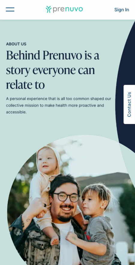
It would have been easy to establish a creative direction for Prenuvo’s website that speaks to its users’ anxiety and fear. However, this would have been antithetical to the reason Prenuvo exists to begin with; to provide hope, much-needed clarity, a sense of peace, and even control. The design had to speak to Prenuvo’s innovative, approachable, and trustworthy tone and voice.
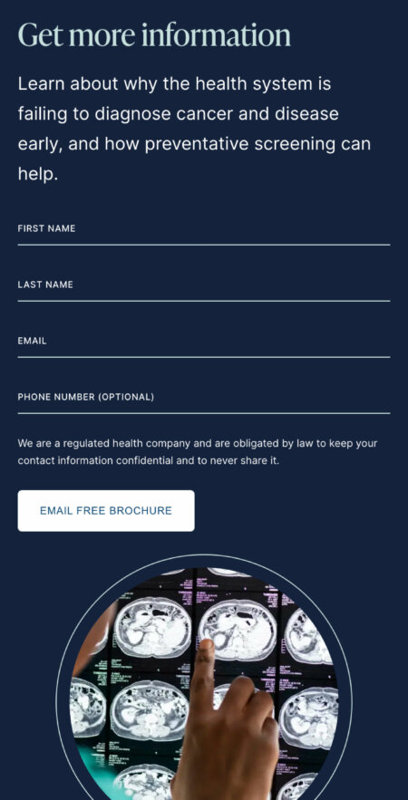
Without a library of custom photography to pull from, Massive’s team of designers began searching for stock photos that provided context but also centred around vitality and health. An image treatment was created reminiscent of the actual scans, giving the user a sense of looking into something.
Serif headings, paired with a sans serif body font (inter) provide a mix of sophistication and elegance while remaining accessible and approachable. The animations incorporated throughout the site, such as drop-down menus or scrolls, are all smooth and elegant, accentuating the calm and soothing tone that Prenuvo had established.
The custom series of icons we developed is a subtle gem of the site’s design. Whereas the image treatment speaks to how Prenuvo scans offer clarity into your or your patient’s health, the icons provide transparency into the functionality of the scans.